Pulse checks within digital product design
October 17 2020
The last time I heard about Ian Spalter was on a podcast episode on High Resolution with him which talked about how he incorporated research into design as his previous stints at Foursquare, habitifying users to wear the Nike fuelband and embodying the rainbow which would have informed how the branding of Instagram. This time, I watched the Abstract episode about digital product design with Ian Spalter that mainly uncovered the field of user interface design and user experience design.
Spalter emphasizes that the end users of the products are always put at the forefront when thinking about designing a product, which meant gaining trust from users. In the episode, we see an overview of how the Nike fuelband is configured, how the application looks like and features such as creating goal setting to allow users to improve their habits. From the pulse of the nike fuel band to sync it up with the application, and sleek matte black design of the band, it lowered the barrier of entry for users to want to put a pedometer on their wrists. Instead, the Nike Fuelband was an accessory adorned by everyday people that wanted to track their health. I think that this is what makes design remarkable, as designers often uncover potential pain points amongst users and use this as a means to create products that meet users at where they are.
While there are methods to quantify how well a product is doing, Spalter mentions that product design also involves qualitative methods to uncover pain points within users. Not only does this include user interviews, but also field research. In the episode, we see Spalter embarking on his trip to Japan as he describes the first time he visited. He hikes through zen gardens, and goes on daily walks throughout the city to find mini tokens of delight to capture on his iphone, which all influence design. An insight I was intrigued by was the cultural differences when using Instagram: is it more common for people in the United States to post selfies, while in Japan users would post less selfies and share images differently.
Spalter encourages me as a designer to think broadly about the varying use cases of a digital product and to have the resilience to continuously iterate on my concepts before settling on one. I was surprised by the hundreds of iterations that Spalter and his team did when rebranding the Instagram logo. From playing with colors, linear gradients and rounded rectangles, the audience were shown multiple interpretations of how designers perceived the Instagram logo. It was especially interesting to see the use of a design exercise that Spalter gave and asked his team members to draw an instagram logo from memory: there was a recurring theme of a circle in the middle as the polaroid lens, the flash and surrounding rectangle. After defining the shape of the logo, colors variants were applied. Admiring Spalter’s creative muscle to constantly ideate different variations of the same thing, I hope to develop that skill as well.
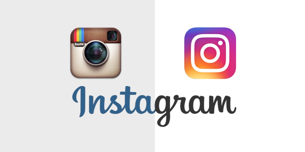
Instagram logo redesign | Image: Medium
Something I particularly enjoyed about this episode is the acknowledgement of the implications of design on human psychology. This was shown through the example of the bottomless scroll feature by Aza Raskin. Raskin uses the metaphor of drinking from a wine glass. When you are drinking from a wine glass there is a process of putting the glass down to stop and think, “do I want more?”. However, with a bottomless scroll, it is infinite. This behaviour encourages addiction and mindless consumption. Additionally, Spalter and his team explore the idea of tucking away the number of followers on Instagram to remove the aspect of garnering the most likes. While their team shows screens of minimizing the followers count, it seems like it has not come into fruition in the application. While it is important to acknowledge the harmful effects of product design, I think there needs to be a stronger advocate for iterating designs when these negative side effects are revealed.
This episode has affirmed my love for product design but also encourages me to be a more ethical designer throughout the design process. Through multiple iterations, I am certain there are opportunities to find better interactions to help users have enjoyable experiences online, but also maintain a healthy relationship with technology.